 I don't know if I am going to use the one of Adria, I would like to get one of her smiling, but these were sure fun to make!
December 31, 2008
December 30, 2008
December 29, 2008
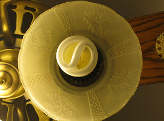 I think both of these can fit into a few different catagories, but I think this one is...
Perception, and patterns. I like the way the light bulb is the focal point, and then you have the glass around it with patterns on it, and then the patterns in the base of the fan, and the patterns in the blade of the fan. I wish the lighting was a little more even in the picture, but that was because the other two lights on the fan were on and this one wasn't. I actually like this pictures composition though.
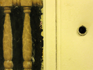 This one I think fits in the Texture, and Lines catagory. Interesting the things you can take a picture of, and how they can draw your eyes into it. My front door is a peice of junk in reality, but this picture shows a different quality about it I think. Its fun practicing, and seeing what I can find.
I used the manual aperture macro setting on my camera to get these pics. I zoomed in on the fan, and just did a normal range on the door. I didn't change the coloring or anything else in the pictures which is something I usually edit in picasa 3. Its fun to take a picture and not have to do anything to it! The one thing I did do in editing is I cut a little bit off the top of the picture of the fan to make it more even with the bottom. I also used a fine shutter speed setting. I don't know how much of a difference it made, except for capturing a little more detail I think.
I was looking for some info on composition, and found a site that mentions 10 elements.
Pattern
Symetry
Texture
Depth of field
lines
Framing
perspective
space
Balance
color
I am going to give myself an assignment/challange to take a picture using these elements. I will post what I come up with. Feel free to give input!
Pattern
Symetry
Texture
Depth of field
lines
Framing
perspective
space
Balance
color
I am going to give myself an assignment/challange to take a picture using these elements. I will post what I come up with. Feel free to give input!
December 28, 2008
December 26, 2008
Lesson learned by hands on
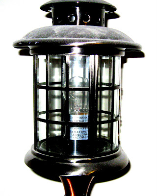
I learned a few good lessons with this one.
It was just an experiment, so don't judge to harshly. lol
#1 make sure your subject is the way you want it! hehe I could have taken a few moments and a baby wipe or two to the top of it, to rid it of the dust.
#2 Pay attention to detail!! (Uncle Jay, I know you told me that already, but I tend to be a hands on learner, and now I see why you find it so important. lol I knew it was important, just didn't fully understand it.) : }
My subject could have looked a lot better if it had some room on top, and I had to straighten the image in Picasa.
#3 Pay attention to shadows better. I don't think they look to bad on here, but I probably could have made them less noticeable at a different angle. I am going to try this image again. Let me know what you think!!
P.S. I totally love my new camera! I spent most of this morning learning from the manual. This camera has a ton of options! Yay!!

December 23, 2008
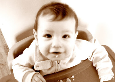
I just want to squish her!!
She wore this dress on her blessing day. This picture is actually tweaked with to a degree in my photo impressions program. I colored the background, and added some contrast with the shadows.
A bit blurry, but I just love her face, and couldn't resist the black and white look!
Her and her cousin, hanging out on the couch.

She wore this dress on her blessing day. This picture is actually tweaked with to a degree in my photo impressions program. I colored the background, and added some contrast with the shadows.

A bit blurry, but I just love her face, and couldn't resist the black and white look!

Her and her cousin, hanging out on the couch.

Subscribe to:
Comments (Atom)
10 elements to consider for composition of a photo.
- Color
- Balance
- Space
- Perspective
- Framing
- Lines /
- Depth of Field /
- Texture
- Symetry
- Pattern /
Blog Archive
-
▼
2008
(14)
-
▼
December
(14)
- I don't know if I am going to use the one of Adri...
- Depth of field Depth of fieldNot sure which one I...
- I think both of these can fit into a few differen...
- I was looking for some info on composition, and fo...
- Another one I did for the weekly challange. I wis...
- This was a weekly challange on proudphotography.c...
- Christmas night. I didn't even know it was snowing...
- Here are some new pictures applying the things I l...
- Lesson learned by hands on
- My sweet little cousin. I like profile shots.Pictu...
- Background could be better, but I just love how th...
- Just kidding, I drew this one. lol Had to throw ...
- I just want to squish her!! She wore this dress on...
- Fun with Leaves Just cute!
-
▼
December
(14)
About Me

- J
- I am a House Wife, living my dreams. I am a wife to my dear sweet husband, and I am a mother to 4 beautiful children, 3 girls and 1 boy. I love perfection, but rarely is it possible, so I strive for perfection in the process instead.



+of+Adria+kimmy+005.jpg)
